Ravive
Designing Ravive: From a circular concept to a live D2C brand
Turning a vintage glassware stock idea into a premium e-commerce experience and an automated sustainable service loop.
Brand StrategyVisual SystemE-commerce
4MURS
Translating 4MURS' new brand identity into a structured e-commerce platform. The project focused on simplifying complex purchase paths and building a seamless mobile-first experience to drive conversion.
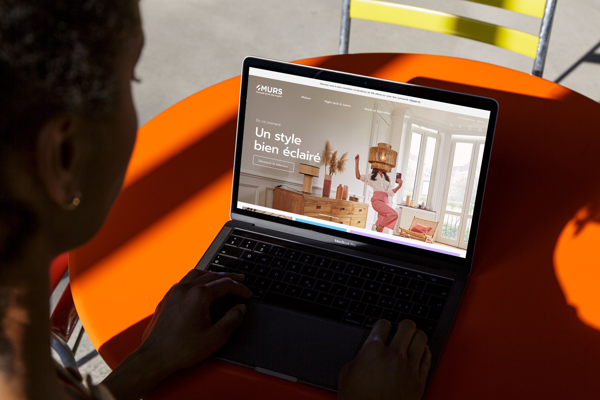
Historically focused on wallpaper, 4MURS initiated a major strategic pivot to reposition itself as a home decor concept store. The challenge was to modernize the brand's image to attract a younger audience, but the existing e-commerce platform failed to reflect this aesthetic transformation.
The challenge: to simplify complex purchase paths while infusing a strong, memorable visual identity tailored to the new concept store experience.
Shifting from a traditional catalog to an inspirational concept store highlighted major UX frictions that disrupted the buying journey.
Fragmented purchase path
The journey between product discovery and cart validation lacked coherence, creating unnecessary cognitive load.
Complex checkout funnel
Low visual storytelling
The historical interface relied on a cold, utility-driven catalog that failed to showcase the new inspirational brand universe.
Broad 18-65+ audience
Desktop-centric interface
The platform's structure was non-adaptive, causing friction for the majority of users browsing on smartphones.
77.75% mobile traffic
A nationwide e-commerce redesign combining high user volume with a global restructuring of the digital experience.
~277K
Monthly visits
High nationwide traffic volume, requiring the design of a robust and stable platform architecture.
6.4
Pages viewed per visit
Deep navigation patterns across the catalog, highlighting the need to streamline information hierarchy to prevent user fatigue.
4m 11s
Average session duration
Browsing behavior focused on discovery and inspiration, confirming the need to shift from a standard utility shop to a full concept store experience.
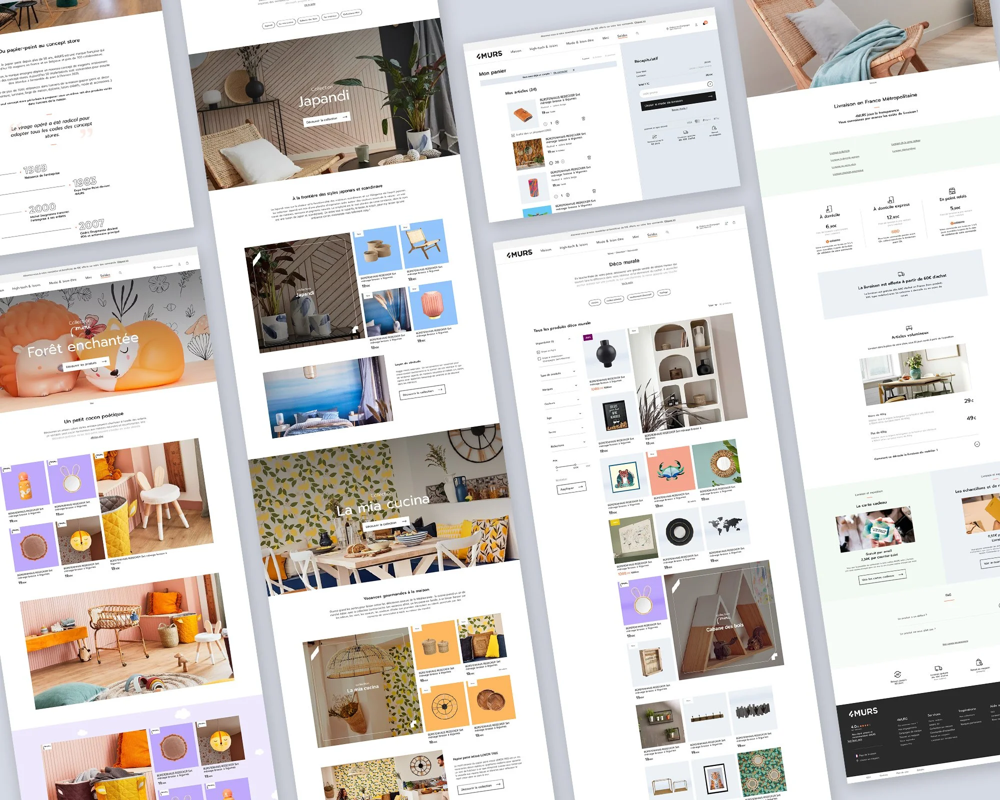
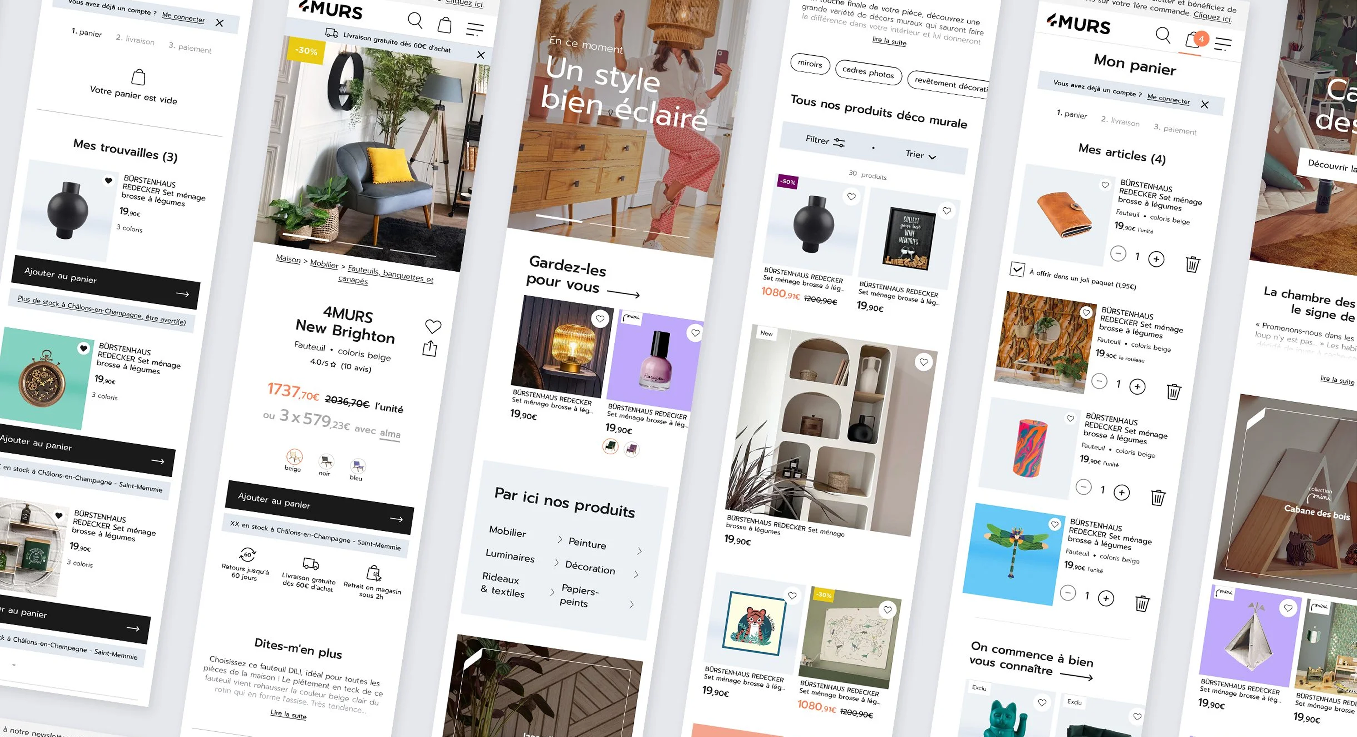
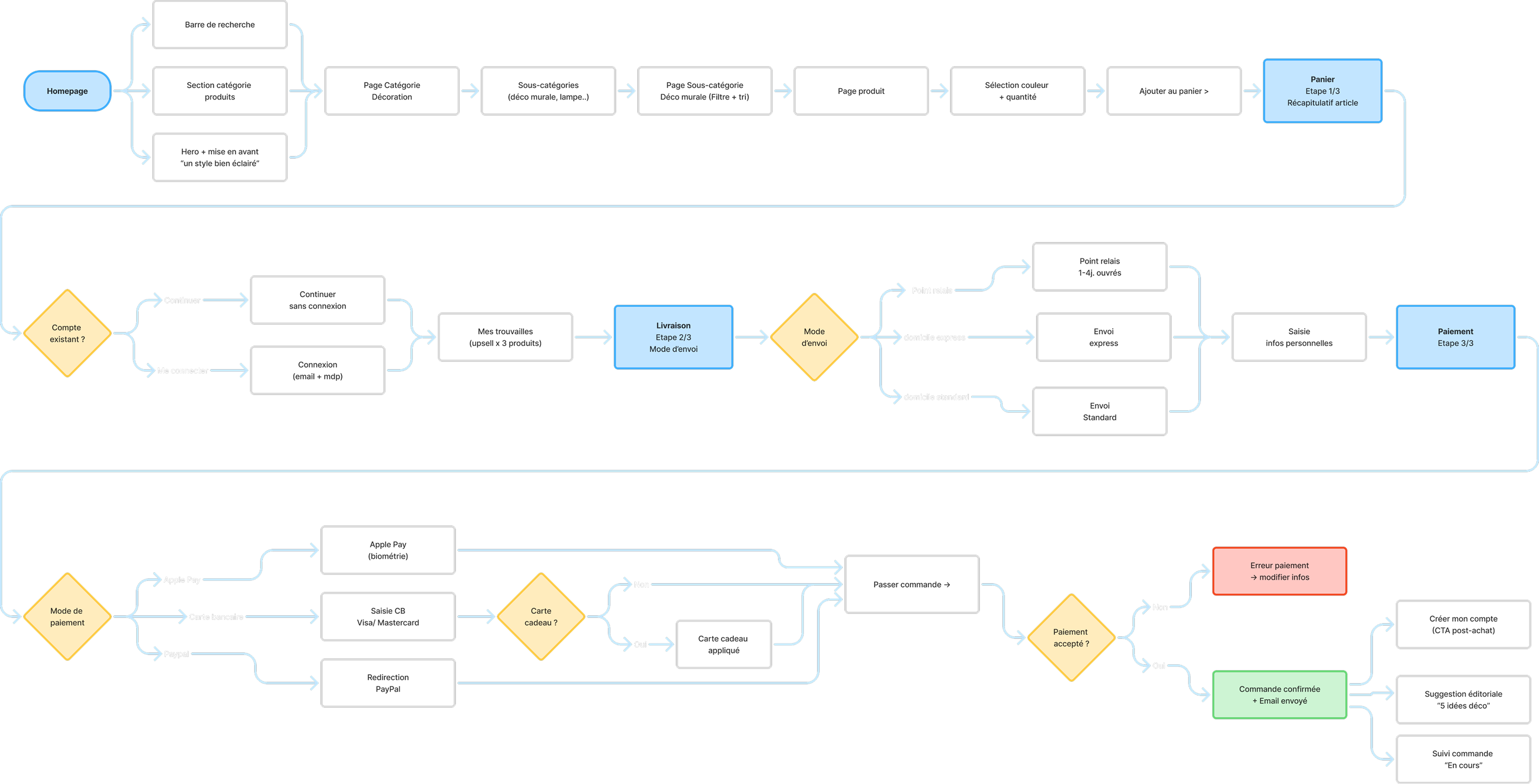
Streamlining the Checkout Funnel. Collaborating with the Lead UX, we completely restructured the conversion funnel to reduce it to 3 fluid steps, eliminating long-standing friction points at checkout.
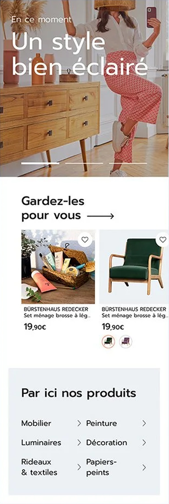
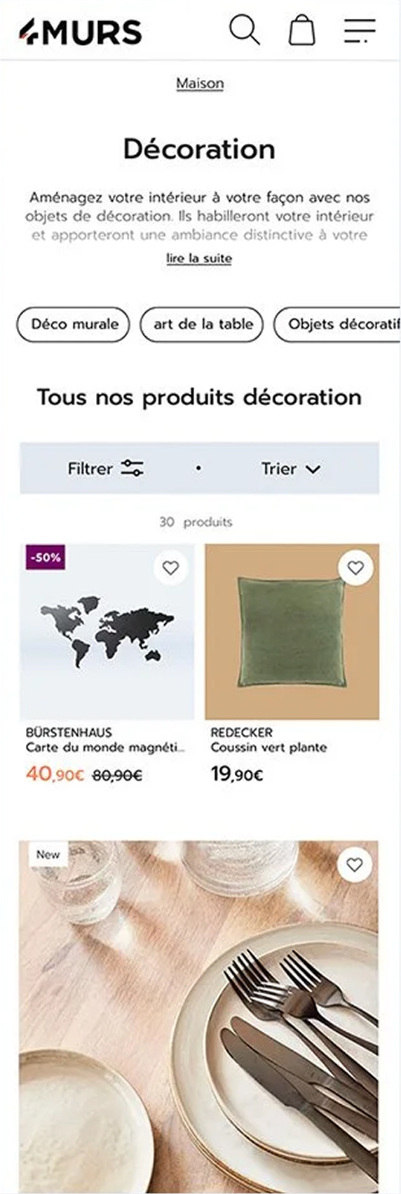
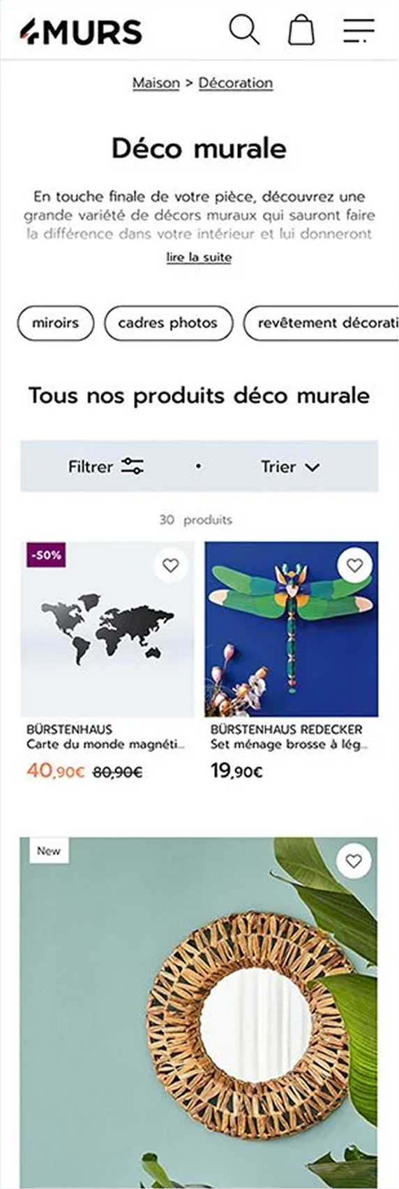
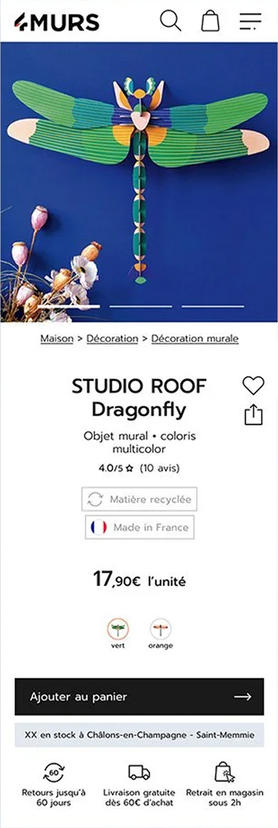
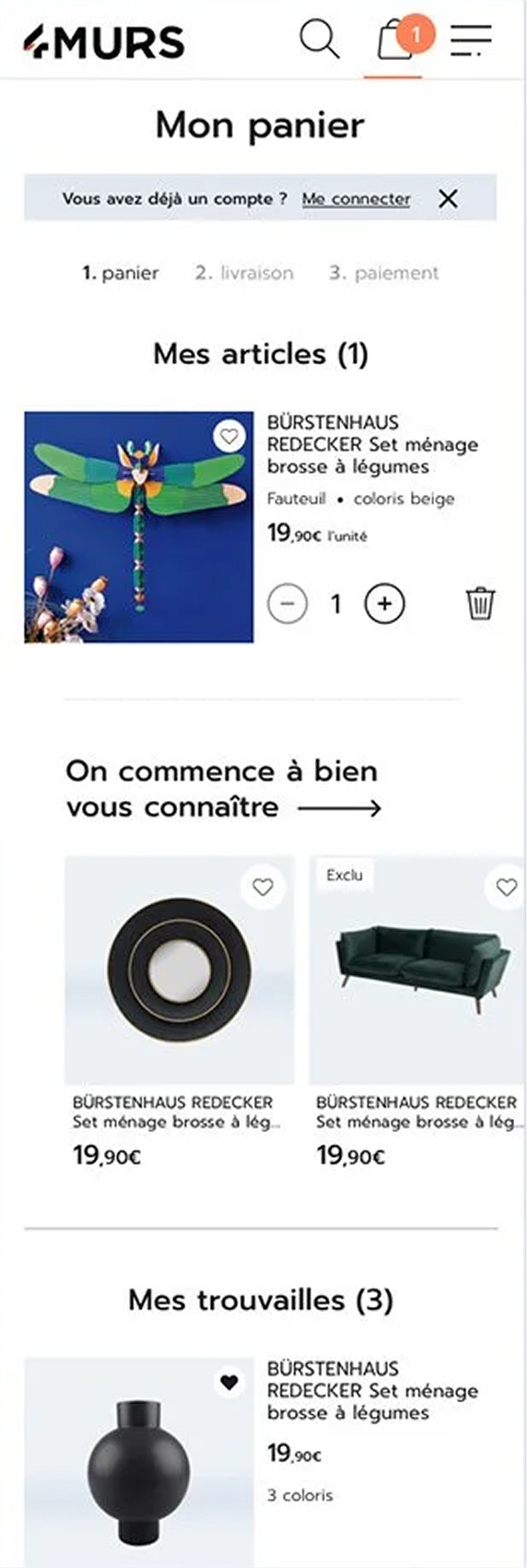
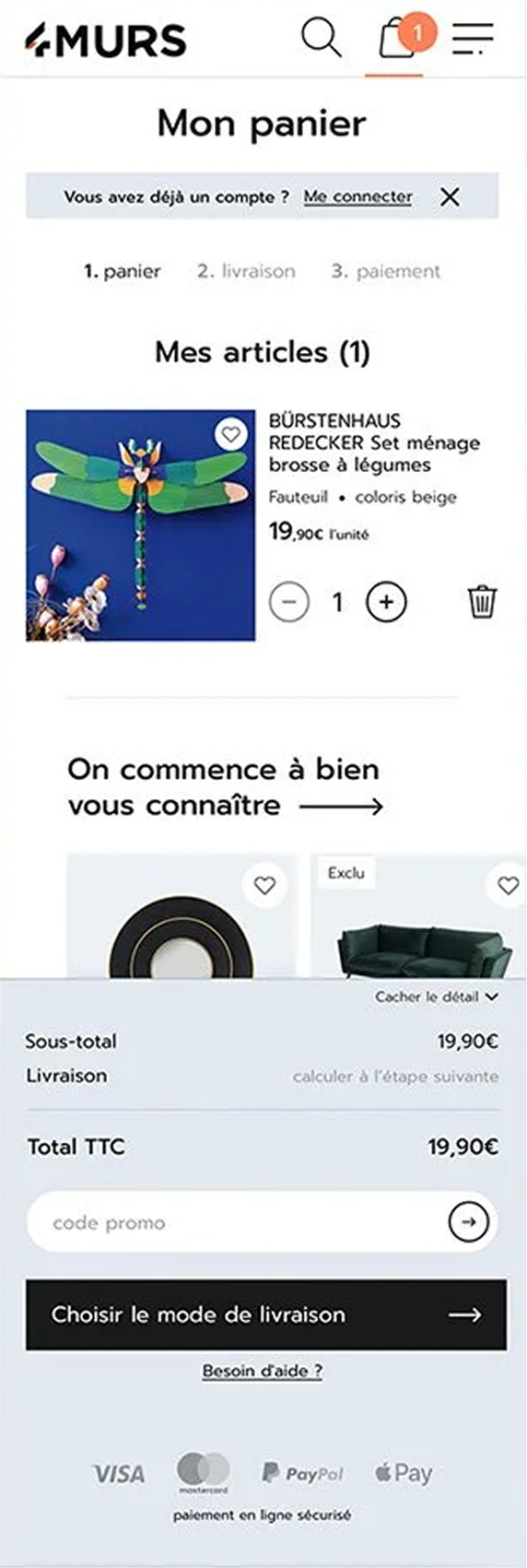
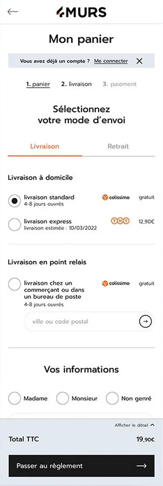
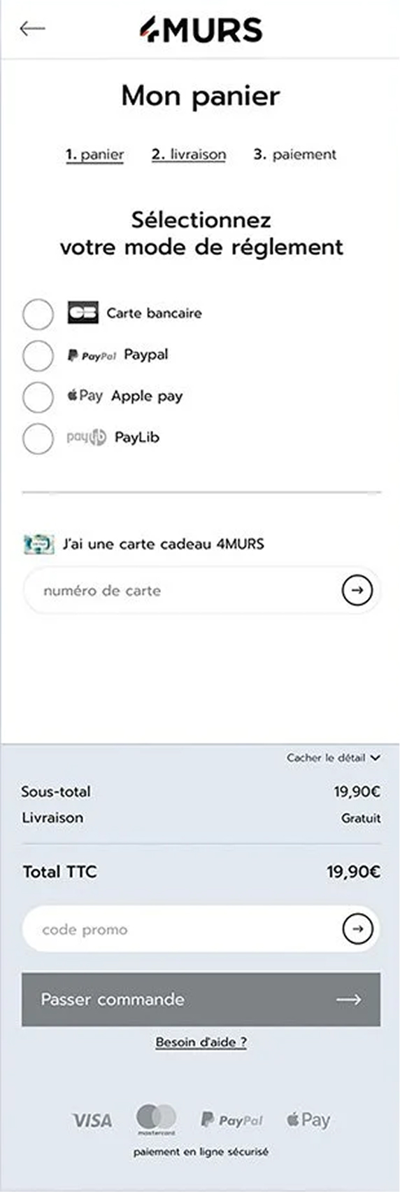
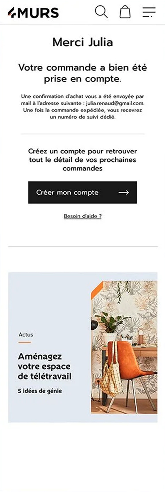
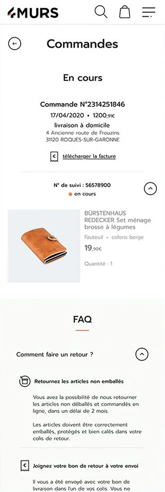
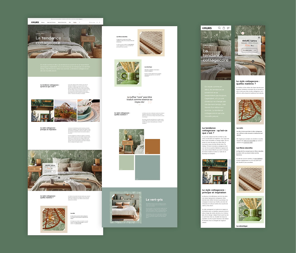
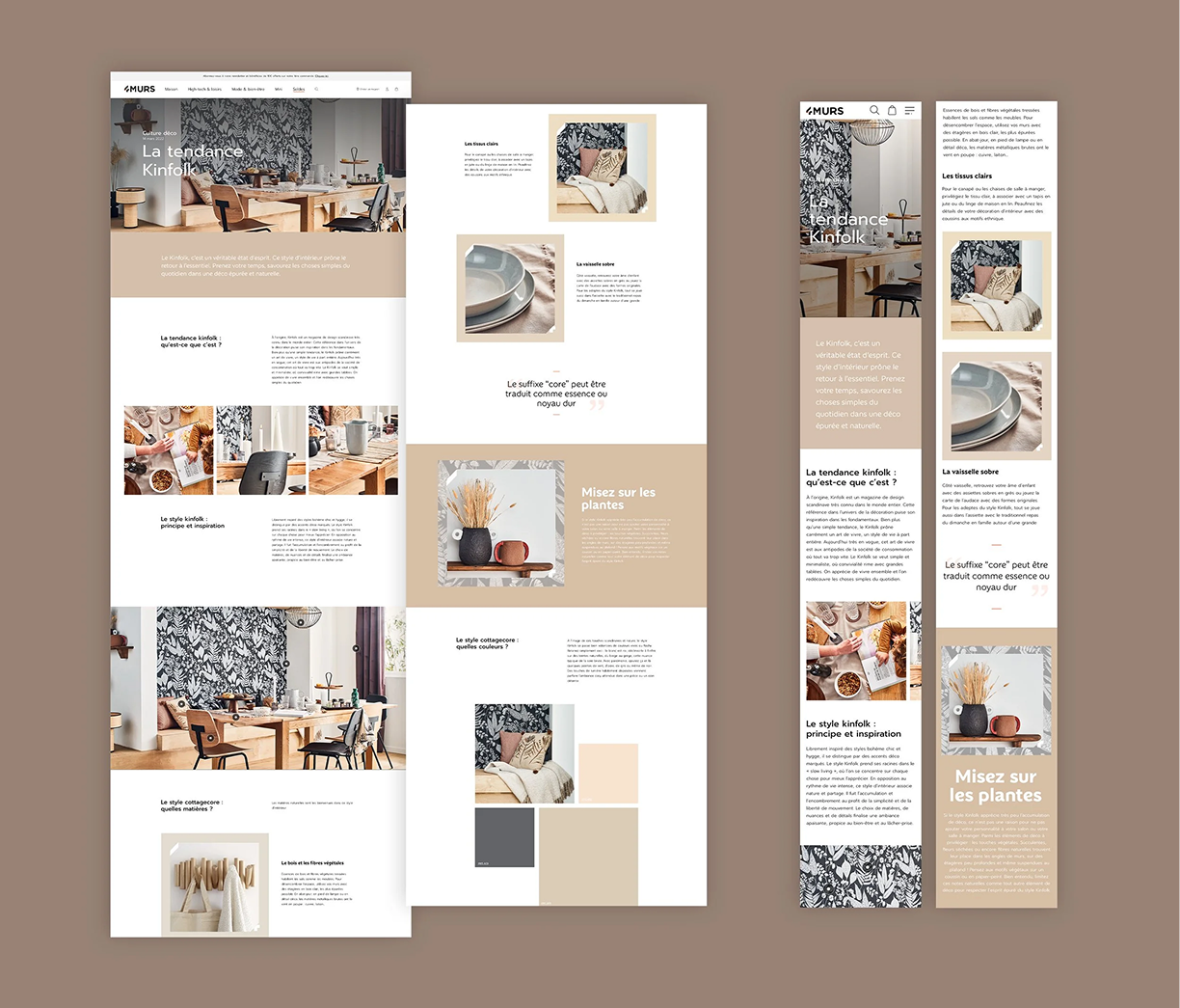
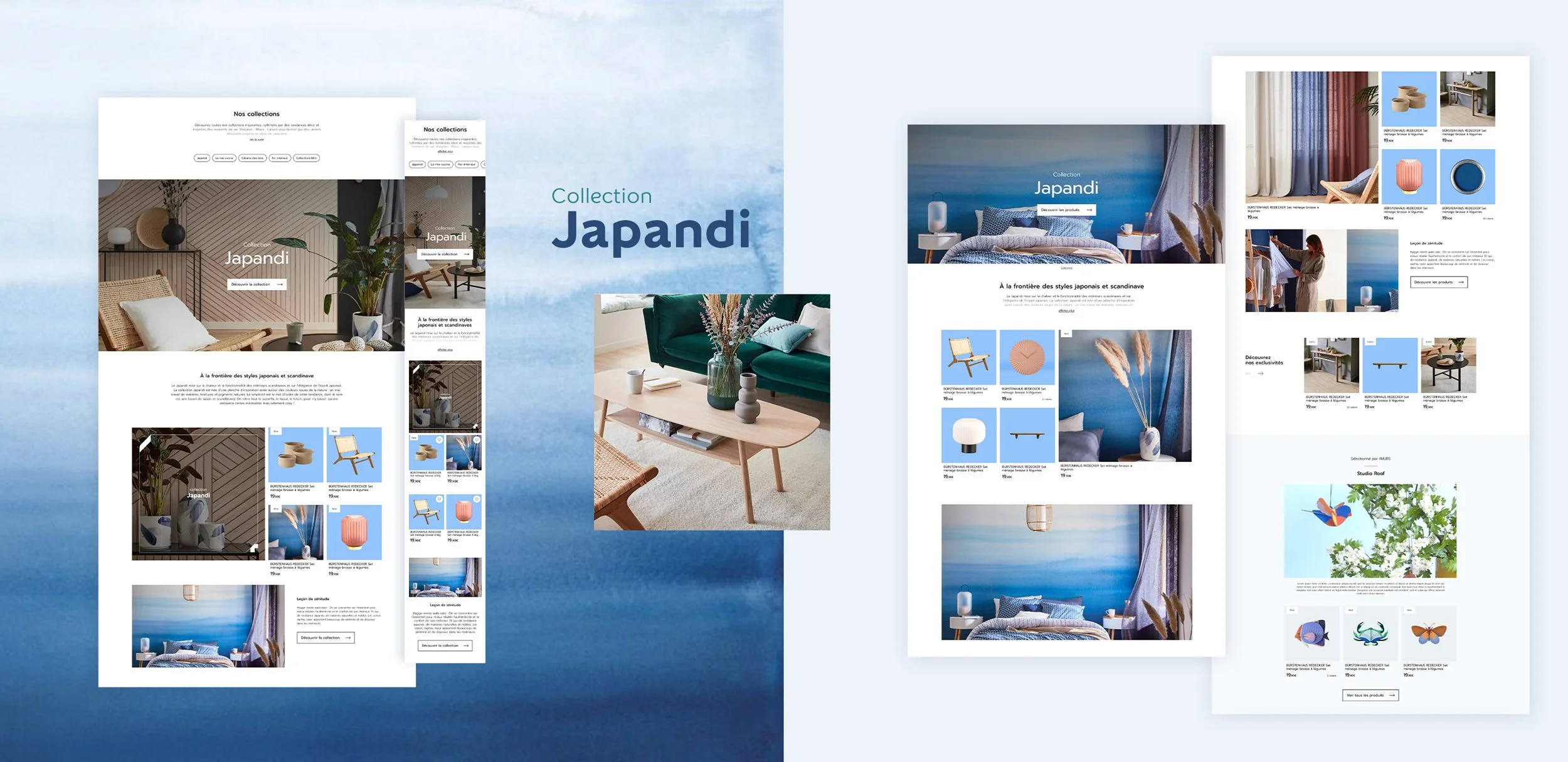
To capture the atmosphere of 4MURS' physical boutiques, the art direction relies on bold typography, a minimalist layout, and a dynamic, collection-specific color coding system (e.g., muted blue for the Japandi vibe, sun-drenched yellow for Mama Mia). This approach creates thematic navigation, instantly immersing users into the aesthetic universe of each trend while maintaining a cohesive, high-performance global UI structure.